Choosing the right icon set for your project
Which icon set is right for your project? In this blog post, we consider five different icon sets and their strengths.
SF Symbols
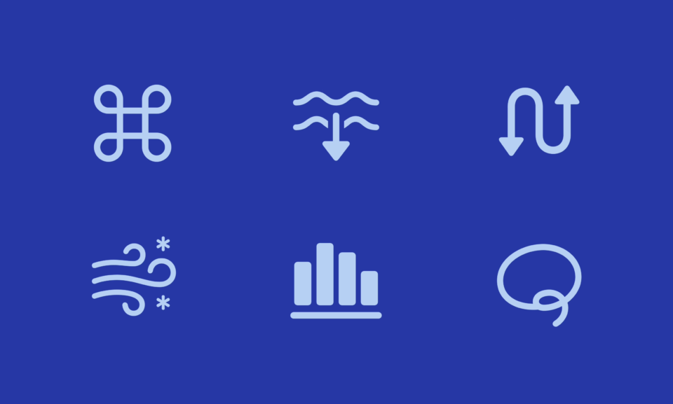
If your project is an iOS app and iOS app only, the choice is simple! The go-to is using Apple’s SF Symbols. It’s crazy easy to implement, can be animated, and looks entirely in line with the OS.
To use this set, you would install the fonts and the SF Symbols app. For the latest on SF symbols, watch this WWDC talk.
Lucide Icons
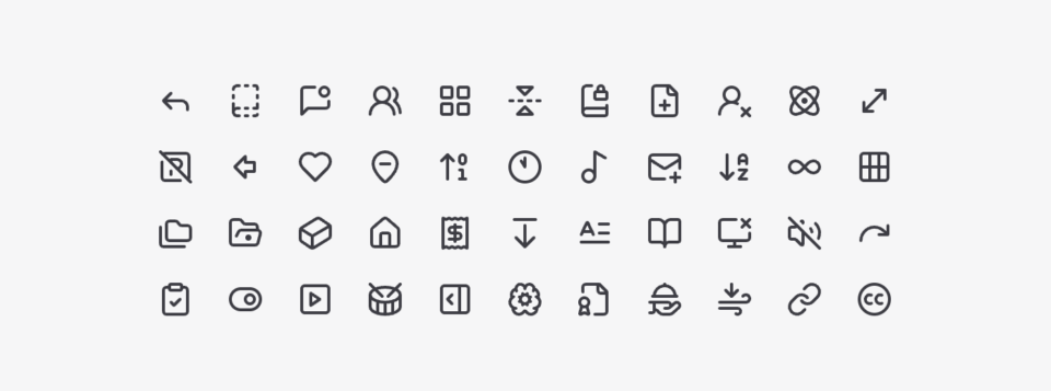
Do you like Feather Icons but wish it had more icons? The open source community came together and solved this problem with Lucide Icons. They extended Feather icons with many more icons, following the style of Feather. This project has 1500+ icons and has a ton of packages.
We’ve used Lucide Icons for our recent work on our shadcn/ui kit.
What’s really cool are the community discussions and a little tool built to share icon designs with others at studio.lucide.dev. However, there’s not that much open source activity anymore with most updates happening around two years ago.
Phospor Icons
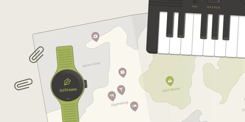
Phosphor Icons is a project by Helena Zhang and Tobias Fried. The beautiful website showcases the icon set in a wonderful way, using real-life objects to show the icons in context.
First and foremost, this is a beautiful project with a lot of great icon work. Phosphor contains 6 styles: thin, light, regular, bold, fill and duotone.
If you look at the GitHub page, there are a ton of integration options. I honestly can’t believe how many packages there are for a side project maintained by just two people.
Obra Icons
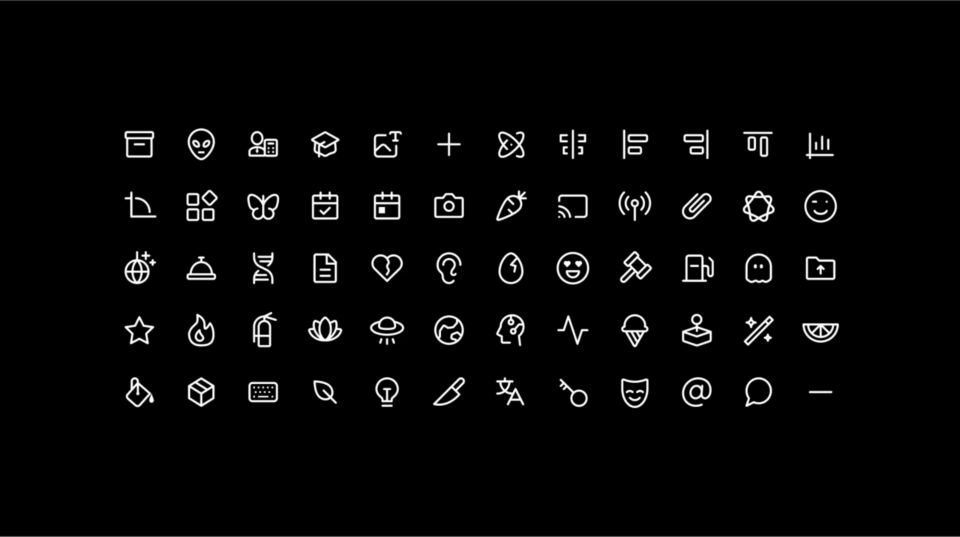
Did you know Obra has its own icon set? Obra Icons has recently been gaining more popularity since going fully open source. It was mentioned in a few design newsletters, something we’re happy about here at Obra Studio.
Obra Icons has 1000+ icons. You can download an icon from the website, use React and Svelte code packages, or use the Figma plugin.
We have big plans for Obra Icons. You can read more about those plans in our previous post about Obra Icons going open source.
Material Icons
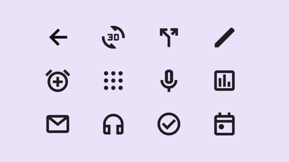
An unbelievable amount of work has gone into Material Icons. Why not benefit from that work by just using Material?
Your work will look a bit like Google’s work, but it will also look like high quality work. Make sure to grab the latest set at fonts.google.com. Since Material Design has a long history, it’s an easy mistake to grab an older set. The latest set, introduced in 2022, has 1500+ different icons and is built on a variable font.
One cool thing about Material is that they support multiple styles. You can change between Outlined, Sharp and Rounded styles depending on the look and feel of your app.
Another big advantage is that the filled icons are done very well. In my personal opinion not every icon looks as nice as some of the previously mentioned sets, but as a global set, it’s pretty awesome.

As the founder of Obra Studio, Johan's mission is to help software companies get to the next design level. He’s forever looking for the perfect balance between aesthetics and usability.