Five tips for creating accessible designs
A lot of accessibility work is technical and is fixable in front-end code, but when the source of that front-end is a design that is inaccessible, that's a problem. In this blog post, we show five tips to create accessible designs.
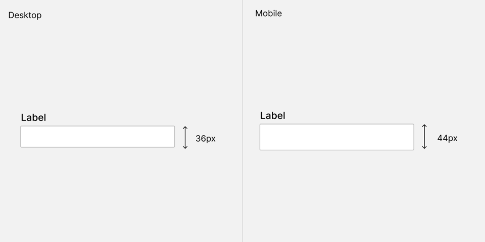
Provide highly tappable areas
It's a classic tip to provide highly tappable areas, but many people seem to be unaware of this; and keep designing tiny controls. Apple at one point recommended that all touch areas would have a minimum of 40x40 pixels, which would equate to about 1 cm in the real world.
These days, they sometimes seem to be breaking their own rules. We see many violations of their own guideline in recent iOS versions. Regardless, this is a good rule and it’s also specified in WCAG as criterion 2.5.8.
Making surface areas large enough to be easily tappable on mobile is a big point in making interfaces more accessible. For desktop, we find that in general, the bigger sizes lead to slightly clunky interfaces. Since a mouse pointer is more precise, depending on the type of software (for general use or advanced use) we tend to go for inputs with a height 28px, 32px or 36px; with 36px being a great default for most cases.
Design highly visible focus styles
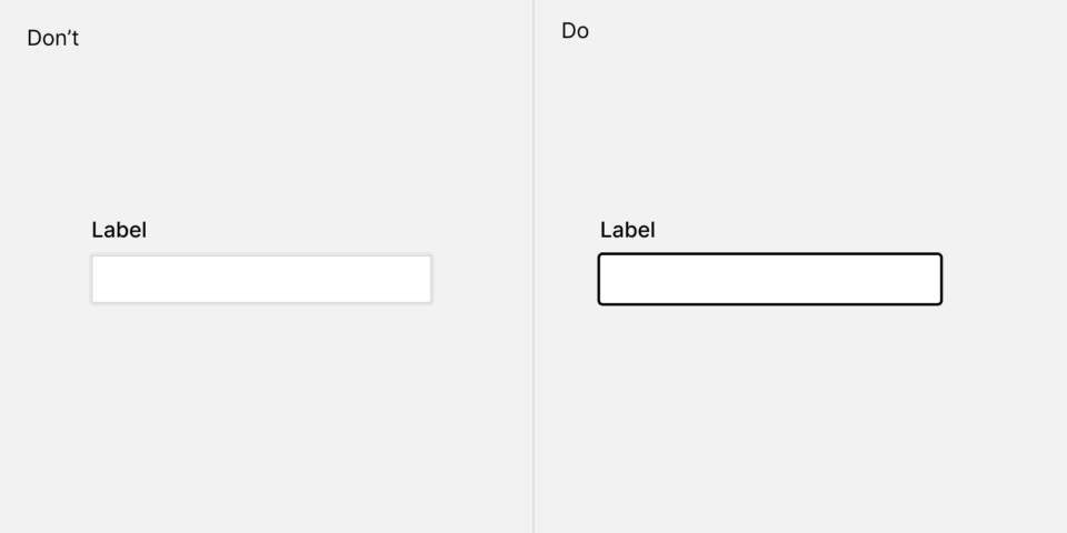
Make your focus style highly visible. It used to be the trend to use a soft shadow around the field to signify the focus style, however this is not enough. It's not about what you find pretty as a designer; it's about what's distinct to a user that's actually using the focus area to navigate through a web page.
The general styling of focus styles across the web was problematic enough that the WCAG made the highly visible focus ring a separate success criterion to reach the AAA level.
Use meaningful text labels for actions
Another classic straight from the 1992 Human Interface Guidelines from Apple.
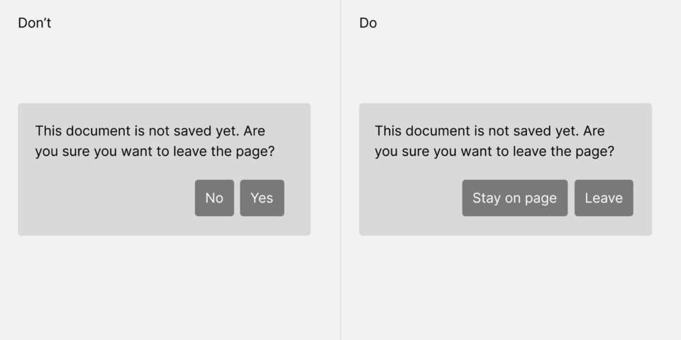
Instead of using options labeled for example "Yes" and "No", use options that are labeled with the action that they will do, for example "Save" and "Don't Save".
Many screen reader users will not read the whole page but focus on the accessible actions when navigating forms.
Text contrast
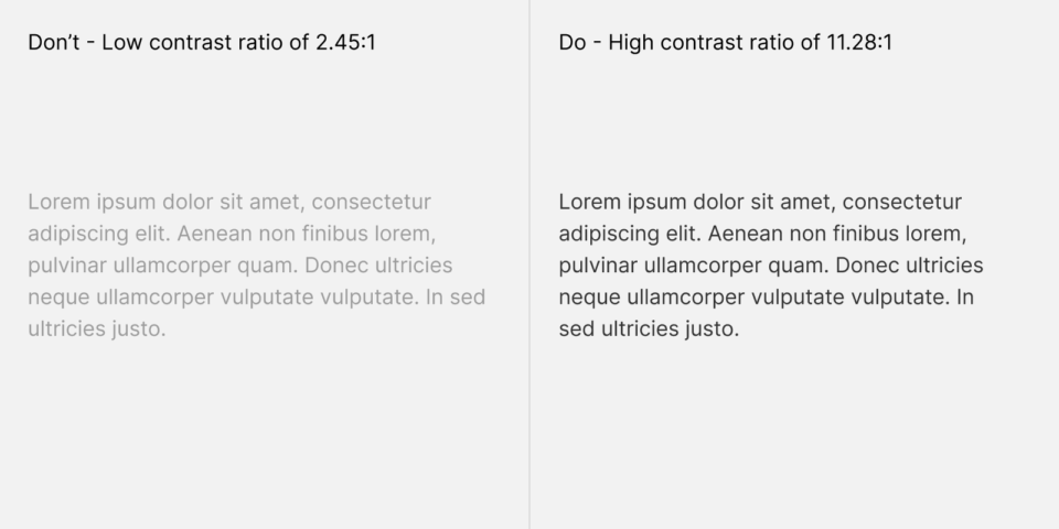
This is a basic accessibility mistake that nonetheless we see all the time. Text should be large enough and have a high enough contrast ratio.
Figma and Webflow have features to directly check contrast ratio inside of the apps. Check out more details on the Figma feature here (on our brand new Figma sub-blog!)
There are two methods of contrast ratio checking. There is the current WCAG2.0 method, and the newer APCA method (for WCAG 3.0, which hasn’t been released yet).
The main difference between these methods is that some color combinations — like white foreground, orange background — are permissible in APCA but not in WCAG2.0.
Some accessibility experts want to conform to WCAG2.0 because the rules are the rules; and they are evaluating against that standard.
Some others permit themselves a bit more freedom in their assertion and move their contrast recommendations to use APCA.
Don't rely on color alone to convey information
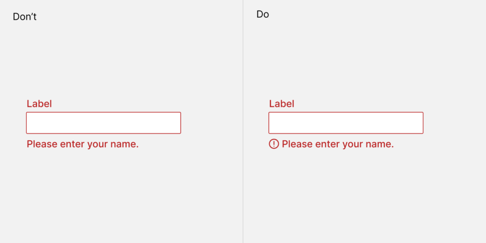
About 10% of men are color-blind. It's a good idea to not rely on color alone to convey information. A practical application of this idea is an error state for a form. In the left example, the error message doesn't have an icon. If you can see colors perfectly, you will likely spot the red color that signifies an error. But if you don't, it's much harder to see what’s going on. An icon helps to signify the error state.
Conclusion
We hope these 5 tips reminded you of ways to make your designs more accessible. It's good to be constantly vigilant about small mistakes that add up.
Looking for a design team that deeply cares about accessibility? Get in touch - let's talk about your project!

As the founder of Obra Studio, Johan's mission is to help software companies get to the next design level. He’s forever looking for the perfect balance between aesthetics and usability.