The how and why behind our Obra shadcn/ui 2.0 release
Last week, we released the 2.0 version of our shadcn/ui kit for Figma.
One of the biggest changes is that we now have an updated and very generous 2.0 Community edition of our kit that contains all shadcn/ui components. This includes the very recent Questionnaire (August 2026) and Chat components (June 2026), like Message.
It also includes a revamped theming architecture that makes it even easier to start customizing the kit to your brand than before.
The Community Edition is licensed as CC By 4.0, meaning the only thing you have to do to use it for almost any purpose is to credit us, Obra Studio.
Find our new kit on Figma Community →
Community vs Pro
Since March of this year, we sell our Figma shadcn/ui kit as a Pro version. This Pro version has more features than Community:
It contains 70+ Pro Blocks, available both in Figma and React. These are ready-made site sections and components to use in your projects, that come in three categories: Marketing, Application and E-commerce.
It also supports all eight shadcn/ui styles (shadcn/ui comes in eight styles via shadcn/ui create), while retaining the simplicity of the kit’s variable setup, by providing different Figma files per style (more on that below!)
It provides access to a CSS Export plugin, as well as a special feature in our shadcn/ui create plugin to swap icons automatically between the Lucide, Tabler, Phosphor and Remix icon sets.
Check out our Pro version, with 20% off during the month of August →
A generous free Community file
The Community file comes in 1 style, Nova, and does not contain any Pro Blocks.
We predict that for many types of teams, the Figma Community file will provide 80% of the value of the Pro kit, for free. The Nova kit is ideal to work with shadcn when you don’t need many style customizations, and rely on shadcn as-is. The Nova style is what the shadcn docs show by default.
It’s a conscious choice for us at Obra to provide a very generous free file.
We have found that an up-to-date free file provides us with leads to do customization work. Some of our biggest clients at Obra have all come via our shadcn/ui kit. For more info on customizing the kit for you, check out the customization services page.
Where Pro shines
The eight different styles are useful for teams that have vast amounts of different design surfaces, with different information densities.
Think dense dashboard, where you would use a style like Lyra - versus a customer-facing mobile app, where you would use a style like Luma.
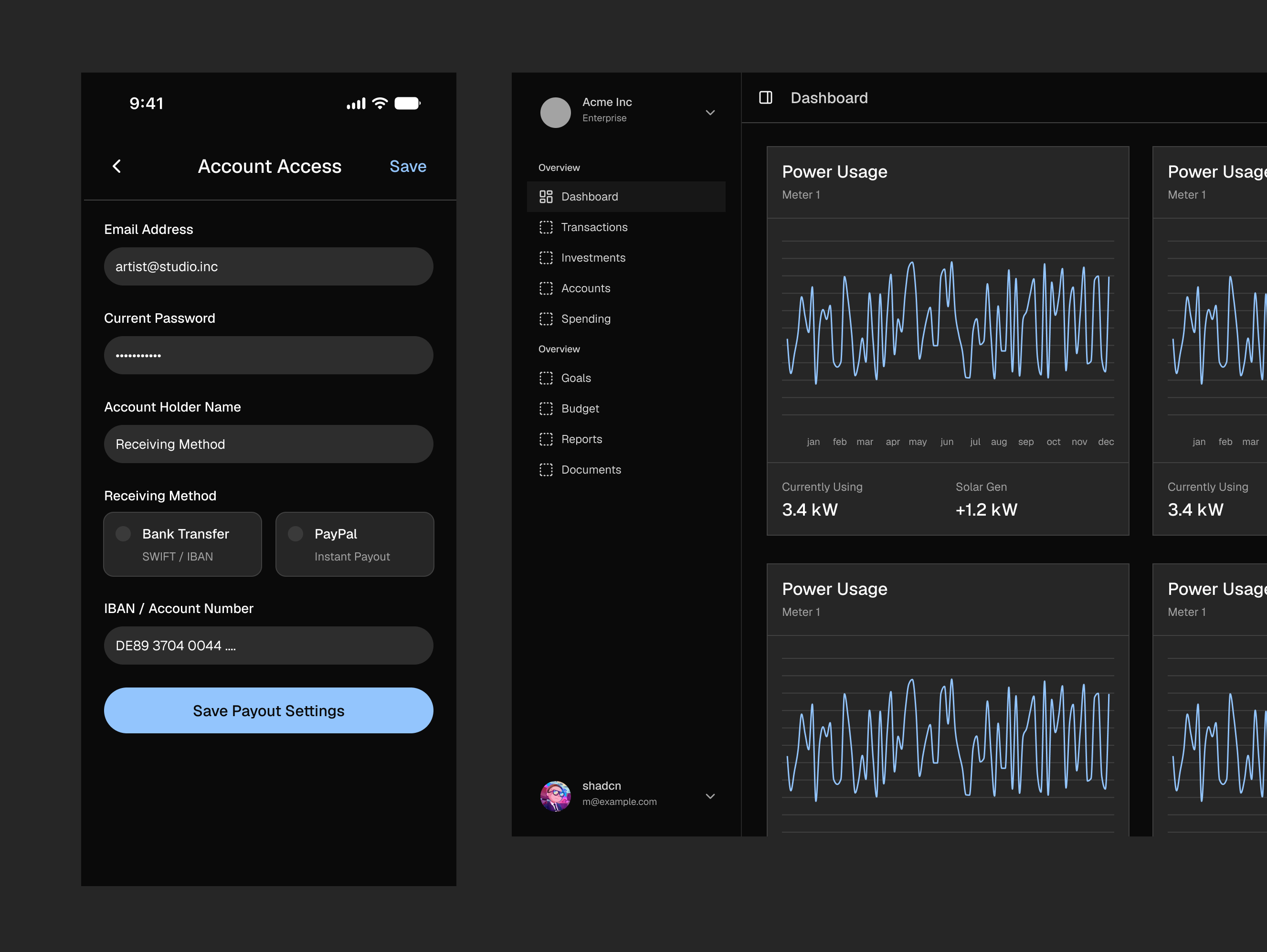
Specifically for teams heavy on design systems that live both in Figma and in development, we think the CSS Export Plugin (Pro only) and upcoming Agent Skills feature (Pro only) are super useful.
While Figma usage is a hotly debated at this point in time, and many teams are leaning towards skipping Figma, we predict professional teams will keep using Figma to iterate visually on the canvas. The need to define things visually and subsequently, needing a way to sync tokens from design to development will stay.
Figma puts token sync via the API behind their Enterprise offering, but with our plugin, you can do it from any type of Figma account.
But then if you do have Figma Enterprise, within our Pro offering, Enterprise clients have the ability to get the source code of the CSS Export plugin. They use it to modify it to fit their own design to dev pipeline. Having a plugin as an intermediary helps with the translation between a design file’s specifics and how it gets translated to CSS. The REST API just gives you the tokens; you’d still have to figure out the tooling.
More in our Enterprise offering here →
A real upgrade path from Community to Pro
Ever since we released Obra shadcn/ui Pro for Figma, we got asked how people can upgrade their kit. We always had to answer that upgrading Figma kits is notoriously difficult.
With 2.0, we made sure that this question has a clear answer: we now provide a clear upgrade path between Community and Pro.
We made the upgrade path additive, by making sure that features that get added when you upgrade path can completely stand on their own.
Since the Nova community kit is technically the same kit that ships with Pro (100% parity in variable setup and components), the upgrade path does not involve changing variables, or making complex change to components.
Rather, it’s one of these:
Start a new design with one of the other 7 styles now available to you
Add or start using Pro Blocks: use the native Figma swap library function to attach the Pro Blocks to your existing Community library, if you started from the free kit
Start using the CSS Export Plugin in your existing file (Standalone, can be used straight from your community file with the right setup - just involves adding some metadata variables)
Use the automatic icon swapping in our shadcn/ui create plugin. Implement designs faster using the React Pro blocks
Giving an answer to “how to upgrade” also explains why we made our community set so generous. Every community duplicate is now a potential Pro purchase. If a team starts with Community, they can later still upgrade to Pro.
Behind the scenes: working hard to keep things simple and easy to use
This release was a ton of work to get right.
Ever since shadcn/ui released its 8 styles, we wondered how to make it happen in Figma in a good way. If you look at how styles are set up on the code level in shadcn/ui itself, specific Tailwind styles are injected to each and every component during the build process of shadcn. This is not something that’s easily replicatable in a design app.
We pleaded for a more logical, parametric design setup (with parameters being size, roundness etc. instead of the difficult 8 “girlfriend names”). Shadcn decided to stick to his plan; and since our objective is to be as close to shadcn/ui as possible, we started looking for a good solution within the boundaries of what shadcn shipped.
Many competitors solved the eight different shadcn styles with eight variable modes in their shadcn/ui kits, but we didn’t want to do that.
We believe that mechanism leads to bloated Figma files where, even if you remove the seven modes you don’t need, you still end up with a file that is full of leftovers to provide the swap mechanism in the first place. After deleting the modes you don’t need, if you would go into any component, you’d find leftovers of the variable swap mechanism sitting on the components themselves, in the form of component specific variables.
The bloat is already apparent when opening a competitor’s file. It starts with having to delete things you don’t need, and needing to know where things will break. We’ve tried this on a trial file and even just deleting the 7 unneeded modes on a fast computer took 5+ seconds each.
People who use design system kits are not always Figma experts. One competing kit’s getting started tutorials starts with how to start removing things from their files to make the file faster to load… surely this is not a good onboarding, and not the way to go. I don’t want to give people a 10 minute tutorial on how to not break the thing they just purchased.
Some competitors even ship with all icon sets included in the file, leading to hundred of unneeded vectors per file, and a library that is almost impossible to publish. Even our limited library takes a good 5 minutes to publish as a clean Figma library (approx 4000 components and tokens) - we wonder what happens when you more than 10 times the amount of variables. We’ve never tried but are scared to find out.
For icons, we arrived at a clever solution for that we don’t need to include other sets than Lucide. First of all, we divide icons by Used and Unused Icons. You can delete the unused icons in seconds, safely, and without breaking anything. Second of all, if you need another set, you can make it happen by swapping the inner vectors of icons with the vectors of other sets in our shadcn/ui Create plugin. It’s a really cool feature where you can, for example, swap the Lucide icon set to Phosphor in seconds. While, if you don’t need that, Phosphor is not even in the file.
But I digress… we were talking about styles.
Two of our main competitor made the choice to go for styles via modes.
This choice leads to needing a “components” collection with hundreds of variables that you don’t need in the first place.
After lots of thought within our Obra shadcn/ui team, the conclusion was simpler than expected. We decided to do exactly what shadcn does in the implementation - encode the properties of a component straight on the component’s layers themselves. A large border radius on a button is simply a large border radius. If you inspect a button in our files with a large border radius, you will straight-up find a radius-lg token. You will not find an intermediate button radius variable that only exists for the mode switching purpose.
To implement the feature right, we decided to double down on our initial decision to ship the 8 styles in 8 different files (9 files if you count Community, which we edit alongside the Pro files). If the border radius of a button differs in a style, it differs on the file level. This allows us to ship the shadn/ui styles exactly as they are in code.
We thought long and hard to arrive at this conclusion - and I had to defend it rather fiercely internally. When we decided to go for it, then we still had the problem of actually implementing it. Implementing all of shadcn/ui in 8 different styles correctly in 8 files is a lot of work.
We had to devise a workflow to edit all Figma files at once, which involved a lot of custom tooling and training within the team. We wrote 2 new custom internal plugins and improved 5 existing ones to make things work. We even landed a PR in figma-console-mcp to have better concurrency when editing multiple files via an LLM.
This was not just the work of one person. We had to train the team to use this workflow. Five different designers worked on various aspects of this kit to get it done. I want to specifically thank Jorre, Robert, Jovi and Daphne for their contributions.
In the end we managed to do it; and the resulting kit is something I am very proud of. We ended up with 20% fewer variables than before, while still supporting all shadcn/ui styles. We made the kit simpler than the previous major release, instead of adding more complexity.
The reason we started our shadcn/ui Figma kit project in the first place was that existing kits were bloated… so it made sense to us to work extra hard to make our kit as easy to use as possible. But let me tell you… that decision did not make things particularly easy for us. Figuring out the tooling and the right way to do it is why it took multiple months to get to a release.
And I am sure we shipped with some minor mistakes too, because of the extreme variance. If you see a bug, we’re always happy to receive feedback.
A secondary reason not go for variable modes, besides the obvious bloat it creates, is that some stylistic aspects of the different shadcn styles simply cannot be expressed with Figma variable modes. Our version of Sera has 2 typographic sets of styles (caps/non-caps) and 2 sets of inputs (boxed and line). Implementing this kind of stylistic variance is impossible in the 8 modes setup.
We don’t know what styles shadcn will come up with in the future, but with the different files, we are ready for anything.
We are 100% sure that because of the architecture of some competing kits, there are problems in regards to parity to shadcn they just can never fix without rearchitecting to different files.
There’s also just so much you can do with variables in Figma. Variables don’t support transparency. Variables don’t support changing directionality. Nor do they support for example the new Figma shaders feature. Leaving certain decisions on the file level helps to have files that are actually editable, creating the ability to both use the underlying shadcn power while creating more unique designs.
We actively contribute to shadcn. While other kits rushed to get a Questionnaire component out just a single day after shadcn released it, then patted themselves on the back for being fast, we took the effort to point out UI mistakes and landed a code fix in shadcn/ui itself.
Shadcn/ui itself has UI bugs that we try to get ahead of - the current button group is bugged in shadcn/ui itself in Sera (see this page), while in our kit, we provide a design solution to fix it - by providing multiple types of inputs (boxed and line, in this case)
Ultimately, for our own sales purposes, I am happy that our two main competitors painted themselves into a corner with the way they set up their shadcn files.
Normally, I wouldn’t talk too much about competition, but the fight for who ships the best shadcn/ui kit has become pretty fierce. I’ve read some ugly words and downright lies in rather idiotic LLM-generated blog posts.
I think customers are not stupid and can see the difference in quality.
Posting self-congratulating posts that your own kit is the best kit, or blog posts that seem straight-up LLM-generated without any editorial revision or oversight will eventually bite you. If that’s what you ship in your writing, it might be a signal of the shortcuts you take in your product. Just saying.
The shadcn/ui kit has become a big part of the growth of Obra, which is why it’s so important for me to do things right.
I believe we are ahead of the competition by doing something that no one else does: shipping a kit that is simple, editable, designer-friendly, while still being extremely powerful.
We worked hard so that a customer of the kit doesn’t have to deal with the complexity behind the work: they should be provided with something simple and easy to use. That’s what we will stand for: a working library that designers actually want to use.

As the founder of Obra Studio, Johan's mission is to help software companies get to the next design level. He’s forever looking for the perfect balance between aesthetics and usability.